
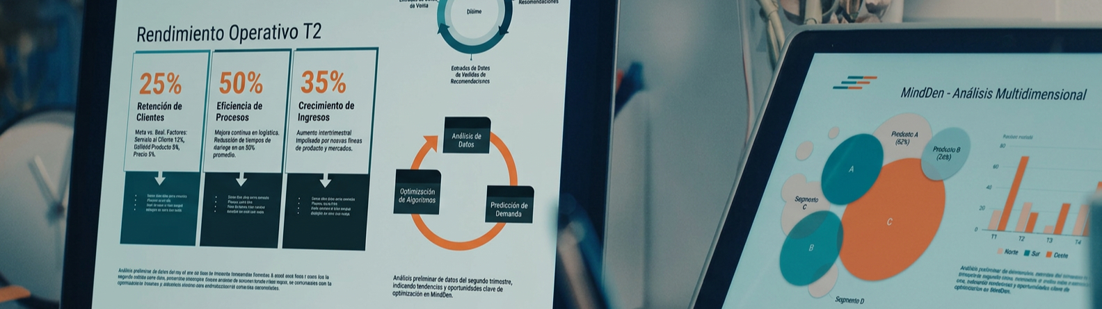
Investing in a robust data infrastructure loses its purpose if the last link in the chain—the dashboard—fails in its primary mission. Often, technical effort is diluted in aesthetic visualizations that, although accurate, fail to trigger an operational response to business problems. We are talking about dashboards with eye-catching indicators, heatmaps, and/or trend graphs that will only make sense when we answer one question: Has this dashboard changed any decision today?
At MindDen, we see business intelligence as not a graphic design discipline, but an architecture of decisions. As Christian Santín, a BI specialist, explains, “BI is not about making pretty graphs, but about helping to make better and faster decisions.”
The mirage of vanity metrics.
 One of the biggest challenges for a CIO or data manager is filtering out the “noise.” This is where the concept of vanity metrics comes in, a term popularized by Eric Ries in The Lean Startup. These metrics offer a positive image but do not have a direct correlation with business health or decision-making.
Because if a number changes and you don’t know what decision to make about it, that metric is pure visual noise.
Santín provides a clear example: total website visits. “While seeing traffic growth looks impressive on a dashboard, it doesn’t by itself indicate whether the business is thriving. You can have record-breaking visits while sales are falling.”
In contrast, the focus should be on actionable metrics. According to Avinash Kaushik, one of the leading experts in digital analytics and author of Web Analytics 2.0, a metric is only useful if it generates immediate action (the Insight-to-Action ratio).
“A good dashboard should help detect a problem, understand what’s happening, and know what to do next,” Christian Santín, Business Analyst Programmer.
| Metric Type | Example (Vanity) | Example (Actionable) | Derived Action |
| Marketing | Total impressions | Conversion rate per channel | Adjust budget towards the most profitable channel. |
| Sales | Gross sales volume | Net margin per product | Eliminate inefficient stock or renegotiate with suppliers. |
| Operations | Number of tickets resolved | Mean Time To Resolution (MTTR) | Detect bottlenecks in the technical team. |
The table above not only differentiates metrics; it illustrates two management philosophies. While vanity metrics offer a sense of linear and secure progress, actionable metrics demand an immediate response from the organization.
The risk of vanity: Following indicators like “impressions” or “gross volume” can lead to complacency. These figures often grow over time but hide critical inefficiencies in profitability or user experience.
The value of actionability: The metrics we support at MindDen act as operational triggers. They don’t just report what happened; they pinpoint exactly where action needs to be taken to correct course or leverage a detected opportunity.
Ultimately, moving from the “vanity” column to the “action” column is what transforms a static report into a real competitive advantage.
The anatomy of a high-performance Dashboard.
For a dashboard to be truly useful for management, it must fulfill three critical phases that Santín highlights in his work methodology:
- Detection: The problem or opportunity must be almost instinctively obvious.
- Understanding: The data must allow navigation to “what is happening” (the technical drill-down).
- Execution: The manager must be clear about what decision to make or which process to change after seeing the variation.
“If an indicator changes color and no one acts, the dashboard is likely not adding value,” Santín states. An effective dashboard is not the one with the most information, but the one that reduces the cognitive load of the decision-maker.
From visualization to strategy.
The true success of a BI project at MindDen is not measured by the aesthetic complexity of its dashboards, but by the speed of response it provides to the company.
Next time you analyze your reporting tools, ask yourself this question: Do your dashboards give you answers or just decorate the meeting room? If the answer is silence, it’s time to stop designing for show and start building for action.